Disguise
– Brand Guidelines •

Logo
Logo Animations
Logo
The Disguise logo it is not the Disguise brand, but is one of our most important core brand identity elements. Consistent placement, sizing, clearspace and color usage, our logo remains recognisable on any surface it's presented on. Our new logo lives in 4 states: Landscape, Portrait, Logomark, Wordmark.
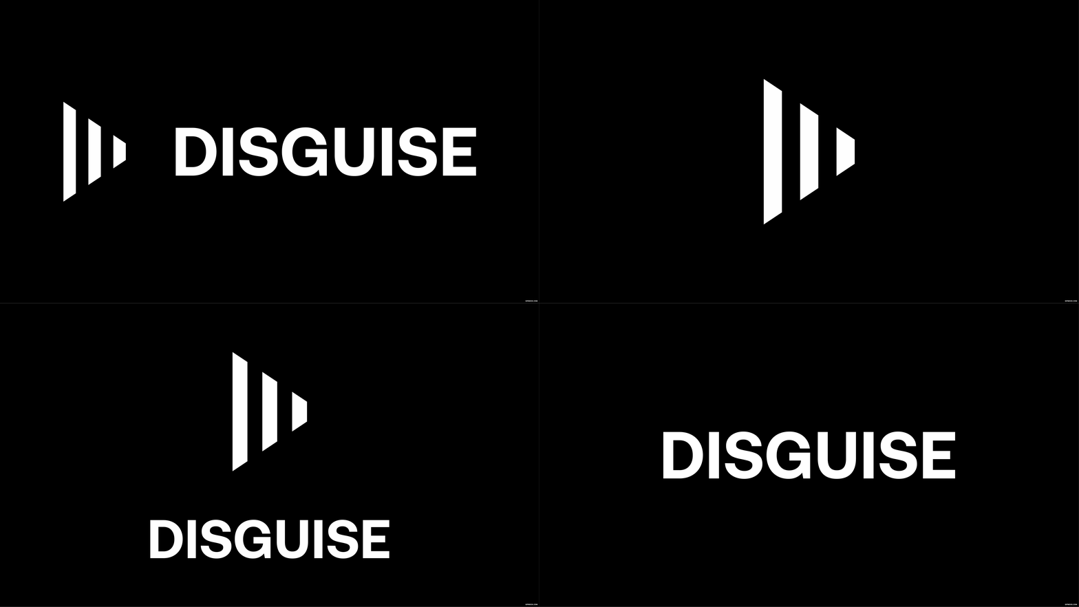
Logo Structure
When placing the logo, it's important that it's given enough space from the margins and other elements on the surface it's presented on. The clearspace principle derives from the size of our initial.


Logo Clearspace
When placing the logo, it's important that it's given enough space from the margins and other elements on the surface it's presented on. The clearspace principle derives from the size of our Symbol or Letter height.


Logo Sizing
Our logo is designed to work at all sizes. The minimum logo size is set to a height of 15px, ensuring proper legibility. There is no set maximum size. If you go big, always remember to follow the rules of clearspace.


Logo Color
The Disguise logo should only be used with black, white, and on our brand colors. Black and white are the primary usage.


Logo on Photography
When applying our logo on photography, always ensure enough contrast between logo and image to make it clear, crisp and legible.


Logo Placement
Our logo placement system is simple and clear, but has enough flexibility to accomodate various content. When placing the logo, strictly use one of the alignments below. Logo sits at the corners if in support of other content otherwise would be centered and bigger.
Landscape
Corners placement

Portrait

Don't
Our logo should always be treated with love and appear consistent throughout all surfaces. It should not be reimagined, tampered with, or modified in any way. Below are some examples of what not to do with any of the 4 logo iterations.
Do not distort the logo

Do not tilt or rotate the logo

Do not apply a color
to the logo and place it
on a colored background

Do not apply black logo on
a dark background

Do not apply white logo on
a light background

Do not outline the logo

Do not apply drop shadow

Do not use the logo as part
of typography. When referring
to Disguise in running text,
always use our brand typeface with capital D - Disguise,
NOT disguise nor DISGUISE.

Logo Animation
Our logo expresses animated behaviours often used for our video intros and outros. We currently have 3 types of animations. A hero animation which is mostly used to represent Disguise with the formation of the Mark (V1). A quick animation which is often used as a quick sting (V3/4). And a featured animation, which in this case is about projection mapping (V2). This last one we don't suggest to use unless the topic is Projection Mapping
Hero V1 - Full

Hero V1 - Mark

Hero V1 - Wordmark

Quick V3/4 - Full

Quick V3/4 - Mark

Quick V3/4 - Wordmark

Featured V2 - Full

Featured V2 - Mark

Featured V2 - Wordmark

Colours
Colored Backgrounds with Type
Misuse
Colours
Our primary colors are simple and clean, with a clear accent color to stand out on any surface where we need immediate attention. We also have access to a colored rainbow, used solely when we provide city- or nation specific content. The colors provide no frills, they have good contrast for web content accessibility guidelines and they let the content breath in a calm, but precise enviroment.
Primary Colors
Our primary colors are black, white and gush green. Simple and clean, with a clear accent color to stand out on any surface where we need immediate attention.
Disguise Black
Disguise White
Primary Accents
We also have access to a bright range of accent colours including pink, green, yellow, green, blue, indigo and violet.
Disguise Pink
Disguise Green
Disguise Purple
Disguise Yellow
Disguise Orange
Secondary Monochromatic Greys
For more subtracted desgins, we have a collection of greys, ranging from light to dark.
Disguise Grey 050
Disguise Grey 100
Disguise Grey 200
Disguise Grey 300
Disguise Grey 400
Disguise Grey 500
Disguise Grey 600
Disguise Grey 700
Disguise Grey 800
Disguise Grey 900
Colored Backgrounds with Logo
Below are the different color combinations allowed to use when combining our logo with our brand colors. The general rule is that the logo can live on all our brand colours but will only need to be either Black or White. Follow these guidelines to ensure consistency across all mediums.

Colored Backgrounds with Type
Below are the primary accents color combination and gradients to use when combining our typography with our brand color.

Typography
Margins
Case
Kerning
Licensing
Misuse
Typography
Straight-forward with a clear, strong and polished voice. It never takes anything away from the topics we talk about. Our typeface is called Aeonik — a variable font family carefully crafted & designed for functionality.

Brand Typeface
Our brand typeface is called Aeonik. Aeonik is a variable font family carefully crafted & designed for functionality. Several OpenType features are provided as well, like contextual alternates that adjusts punctuation depending on the shape of surrounding glyphs, slashed zero for when you need to disambiguate "0" from "o", tabular numbers, and much, much more.
Sample Glyphs
Below are an overview of some Inter glyphs.
ABCČĆDĐEFGHIJKLMNOPQRSŠTUVWXYZŽabcčćdđefghijklmnopqrsštuvwxyzžАБВГҐДЂЕЁЄЖЗЅИІЇЙЈКЛЉМНЊОПРСТЋУЎФХЦЧЏШЩЪЫЬЭЮЯабвгґдђеёєжзѕиіїйјклљмнњопрстћуўфхцчџшщъыьэюяΑΒΓΔΕΖΗΘΙΚΛΜΝΞΟΠΡΣΤΥΦΧΨΩαβγδεζηθικλμνξοπρστυφχψωάΆέΈέΉίϊΐΊόΌύΰϋΎΫὰάὲέὴήὶίὸόὺύὼώΏĂÂÊÔƠƯăâêôơư1234567890‘?’“!”(%)[#]{@}/&\<-+÷×=>®©$€£¥¢:;,.*
ABCČĆDĐEFGHIJKLMNOPQRSŠTUVWXYZŽabcčćdđefghijklmnopqrsštuvwxyzžАБВГҐДЂЕЁЄЖЗЅИІЇЙЈКЛЉМНЊОПРСТЋУЎФХЦЧЏШЩЪЫЬЭЮЯабвгґдђеёєжзѕиіїйјклљмнњопрстћуўфхцчџшщъыьэюяΑΒΓΔΕΖΗΘΙΚΛΜΝΞΟΠΡΣΤΥΦΧΨΩαβγδεζηθικλμνξοπρστυφχψωάΆέΈέΉίϊΐΊόΌύΰϋΎΫὰάὲέὴήὶίὸόὺύὼώΏĂÂÊÔƠƯăâêôơư1234567890‘?’“!”(%)[#]{@}/&\<-+÷×=>®©$€£¥¢:;,.*
Weights & Sizing
Inter comes in three selected main cuts: Inter Regular (400), Inter Medium (500) and Inter Semi-bold (600). All have associated italics. Throughout the visual identity, Inter Medium (500) is utilised the most. Inter Regular (400) is used for smaller type sizes to maximise legibility.
When establishing the typographic system, strive to keep the styles divided by 8. 16, 24, 48, 72, etc. It's important that all designs have an inner logic that provides a clear system to the design.
H1 — XXpx
Abc
H2 — XXpx
Abc
H3 — XXpx
Abc
H4 — XXpx
Abc
Body — XXpx
Abc
Alignment
Large typography should always be left-aligned or centered. It should never right-aligned or justified.


Typography hierarchy simple rule

Tracking
Tracking is the spacing given to all letters in a word. Tracking should be quite tight. Too loose or too tight tracking should always be avoided. Below are some guidelines to follow.
Correct tracking
Too tight tracking
Too loose tracking
Leading
Leading is the space between lines of words. Leading should be optically bigger than the spacing between words, which again should be greater than the tracking. This will result in perfect legibility. Follow this principle for both print and digital type setting.
Correct leading

Too loose leading

Too tight leading

Tone of Voice
For people to listen, our brand communication is driven by substance. We aim to communicate with purpose - always focusing on the value we are bringing to our audience. When we talk, we are bold but thoughtful. We use the active voice with positive language - writing in clean, short sentences.

Principles
When we write we try to be:
Bold
Direct
Personable
Community-driven
Futuristic
We are never:
Sarcastic
Funny
Political
Casual
Traditional
Signature Messaging
Creating the next dimension of entertainment
Layout
Layout is an important part of our design system. Our layout principles are flexible and should always put our content in focus.

Margins
Margins are defined by the logo clearspace.

Columns
To keep things tight and precise, use one of these four grid systems when designing a layout.

1-column

2-column

3-column

4-column

8-column
Typography Aligment
We always set our type left-aligned.


Typography Layout
When setting typography in a layout, follow our simple rules of margins and colums to always come correct. Aim to limit type sizes to a maximum of three diffrent styles.
Title only

Title + Body

Body only

Imagery Layout
We also have the power to use imagery when we communicate. Use the following alternatives and guidelines to use photography correct in your designs.
Titled Frame

Full Bleed imagery

Vertical layout, full bleed imagery

Photography
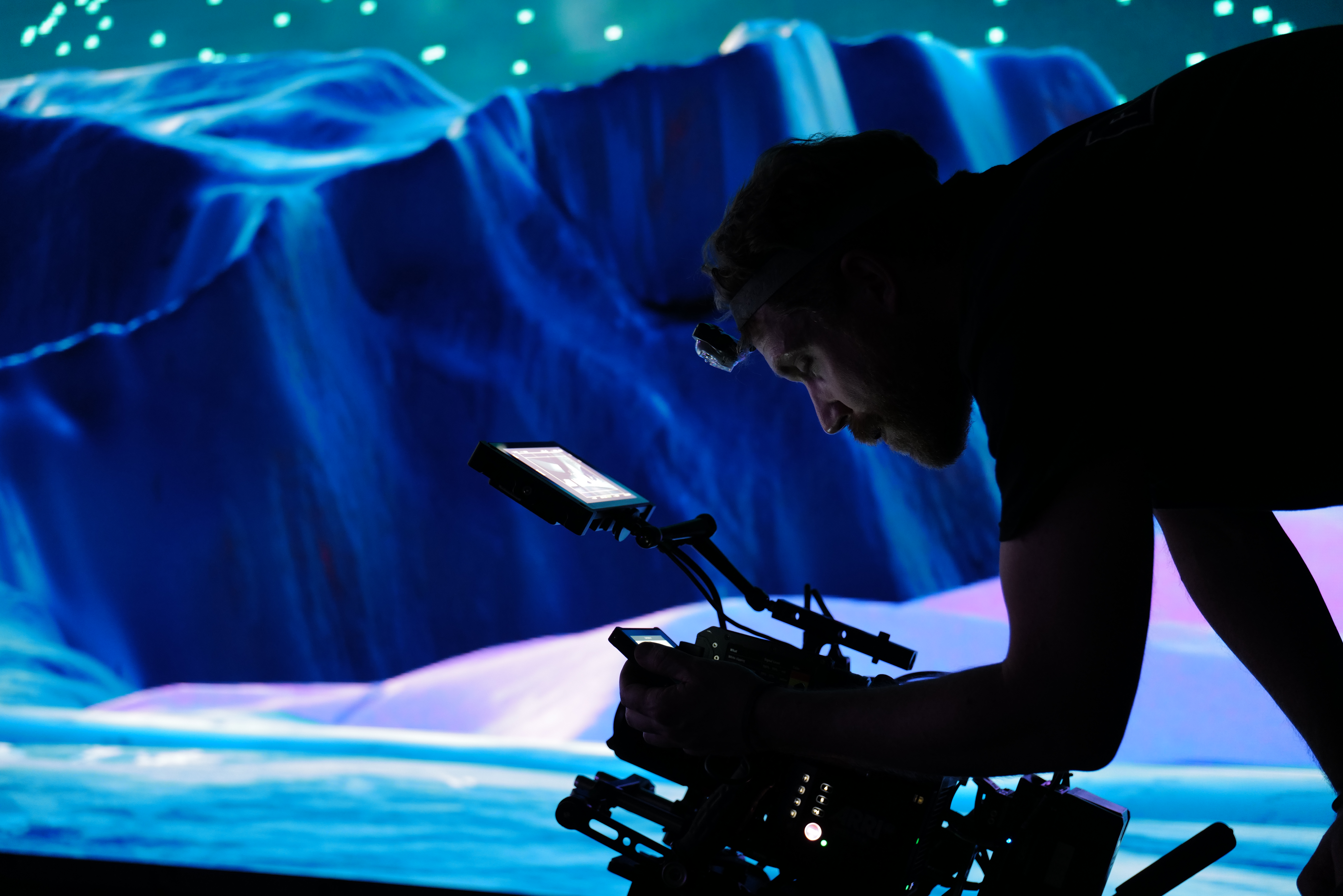
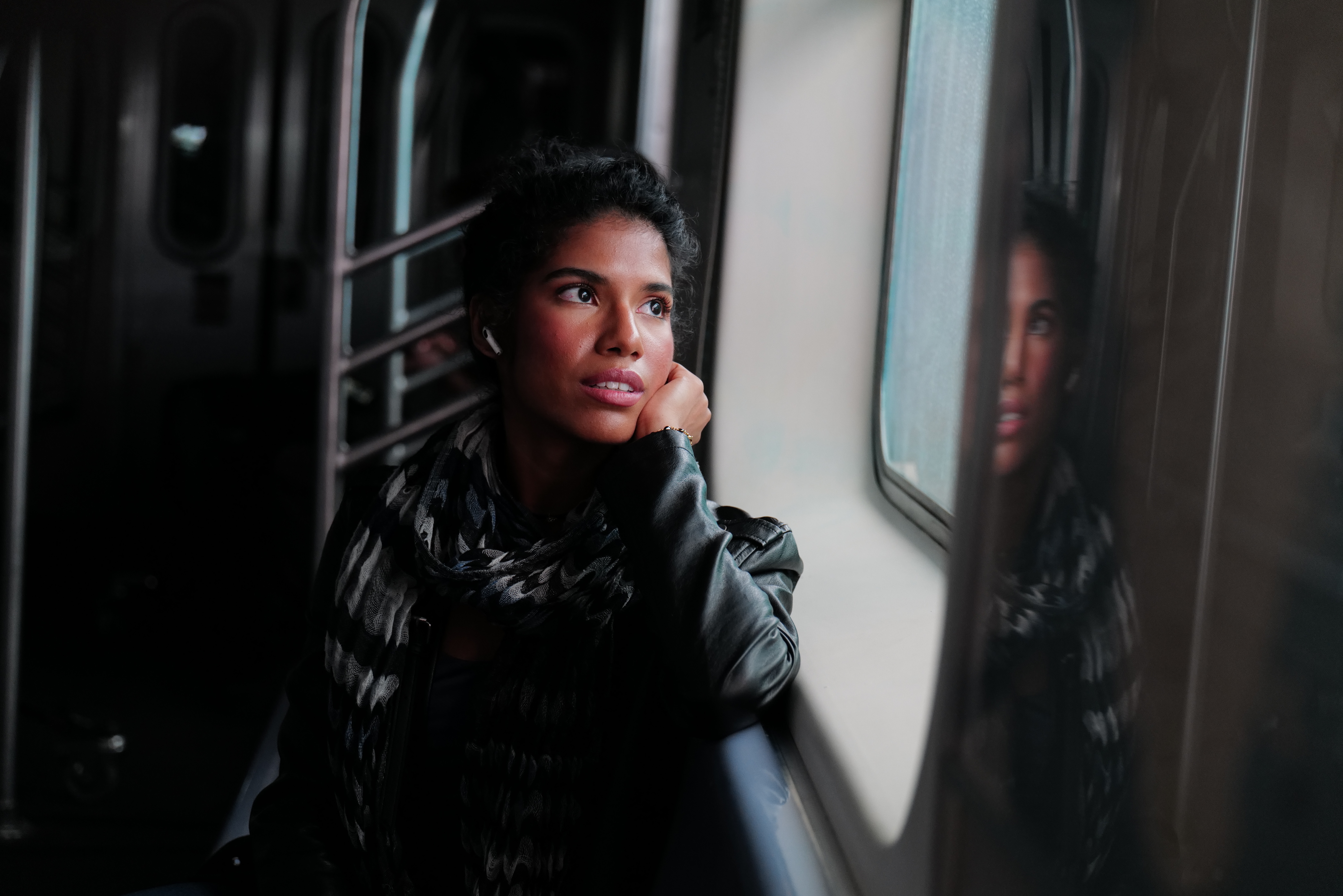
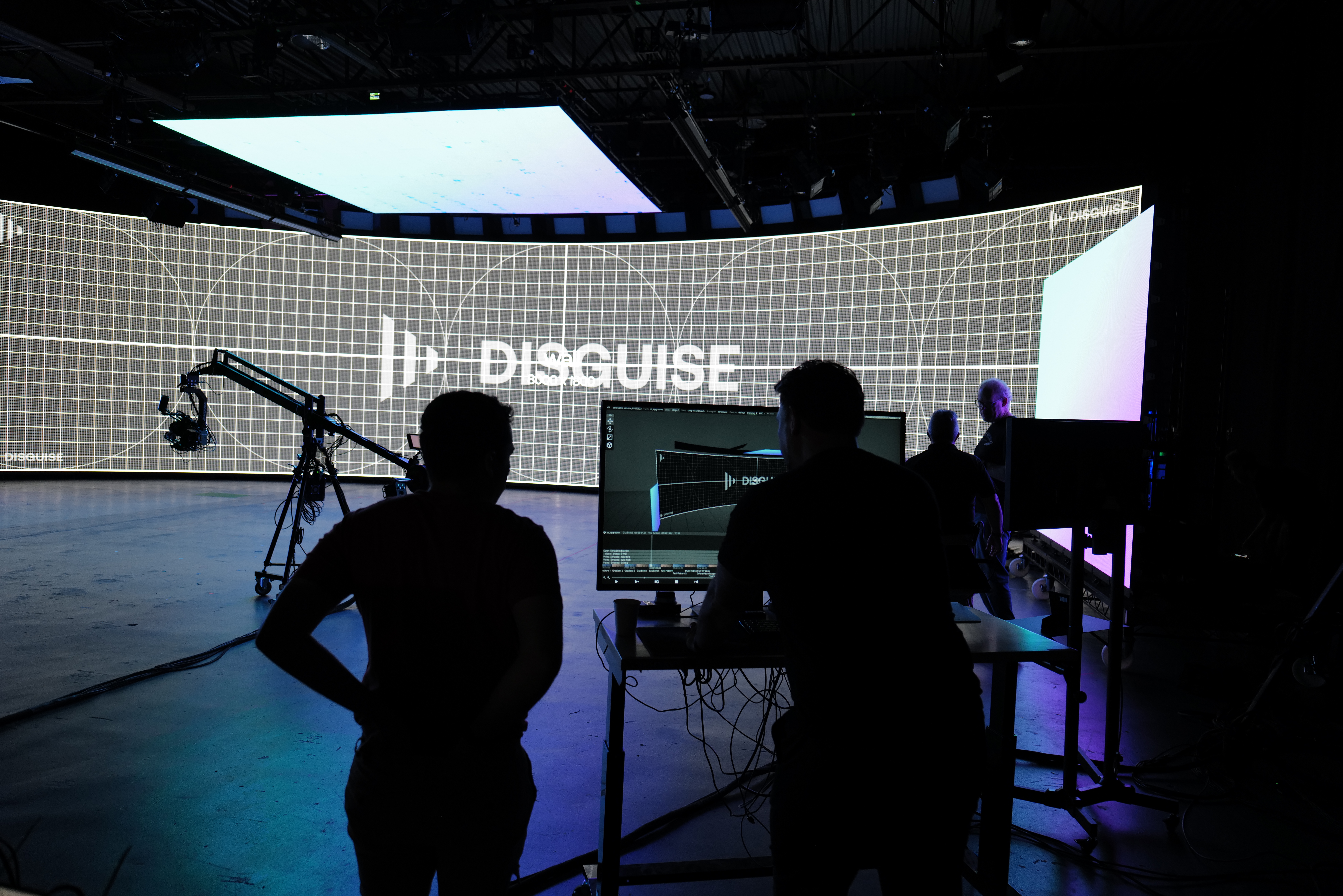
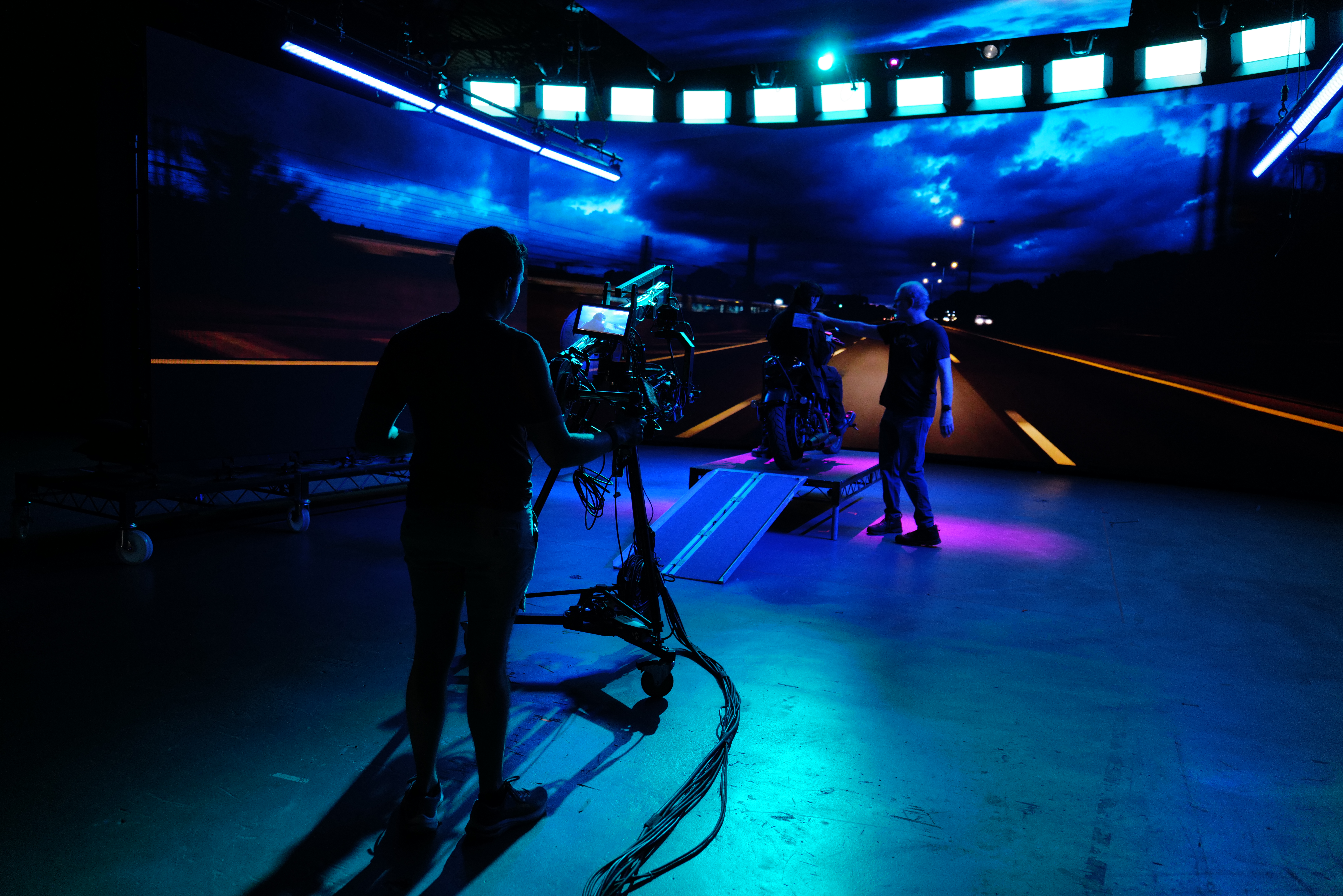
Our photography library is an ever-expanding roster of great imagery from all over the world — provided by people from all countries. High quality photography builds brand reputation.
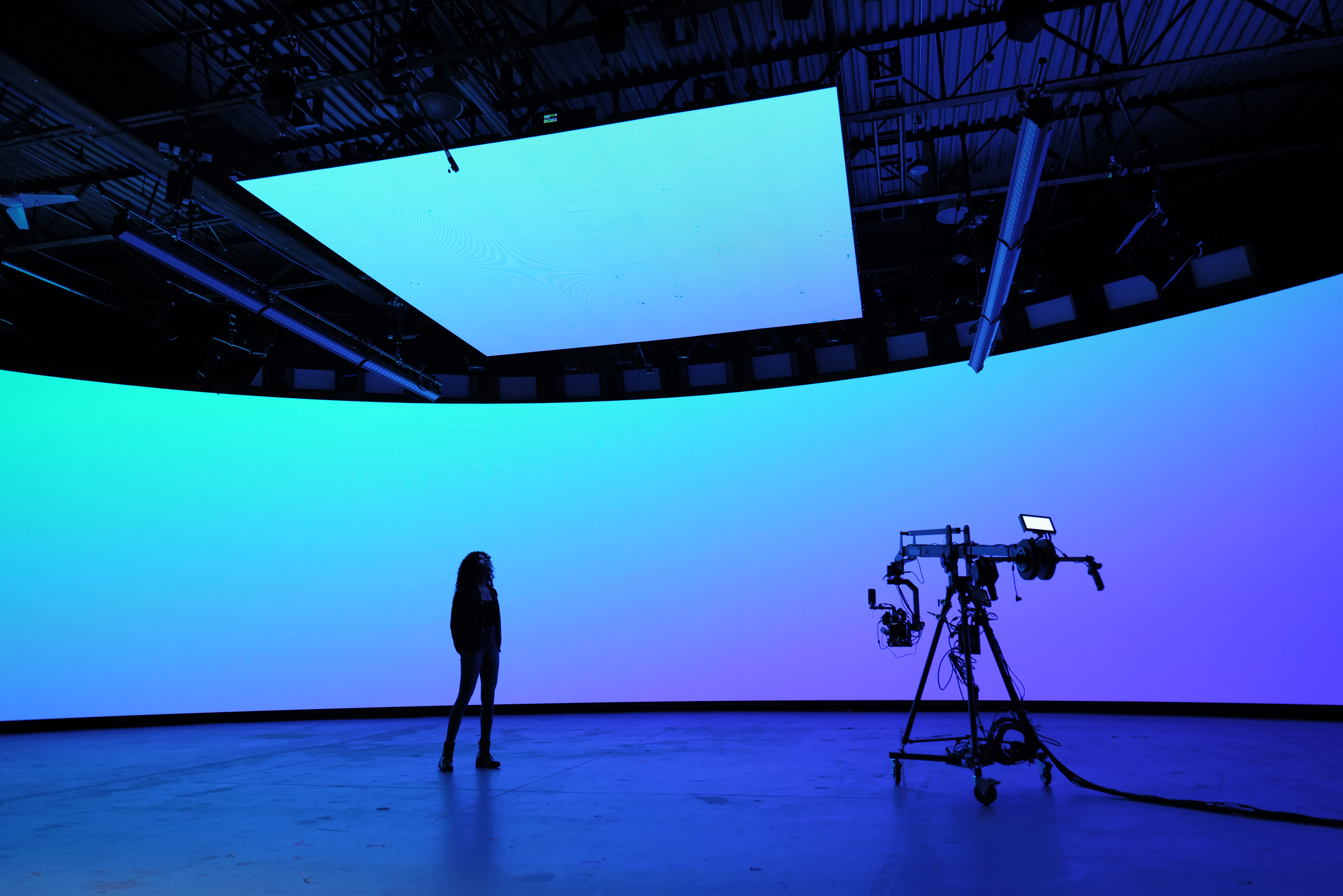
Categories
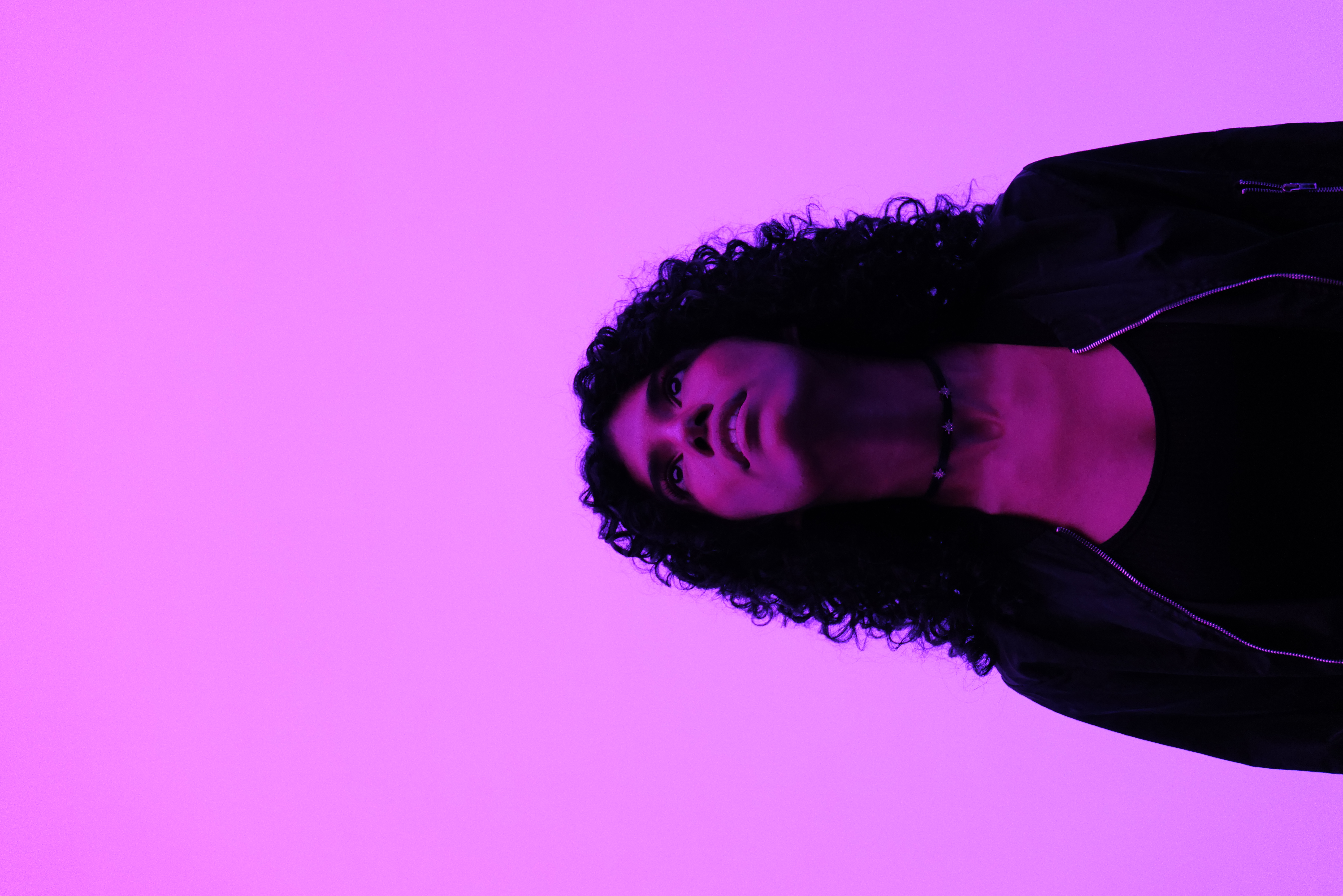
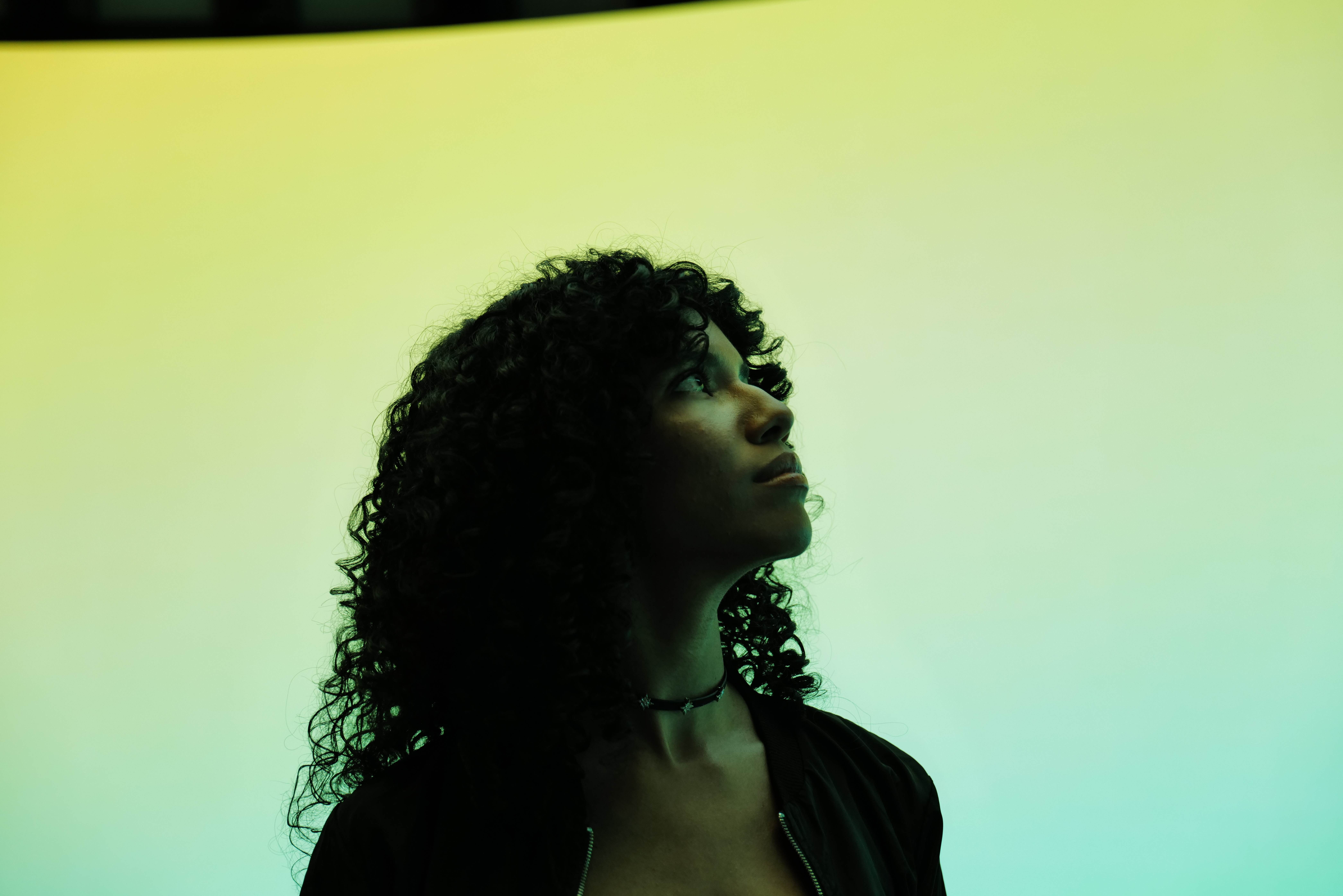
We have two main photography categories: People, Environment and Product. Always ensure to use the most relevant category for your communication message.
People examples



Environment examples


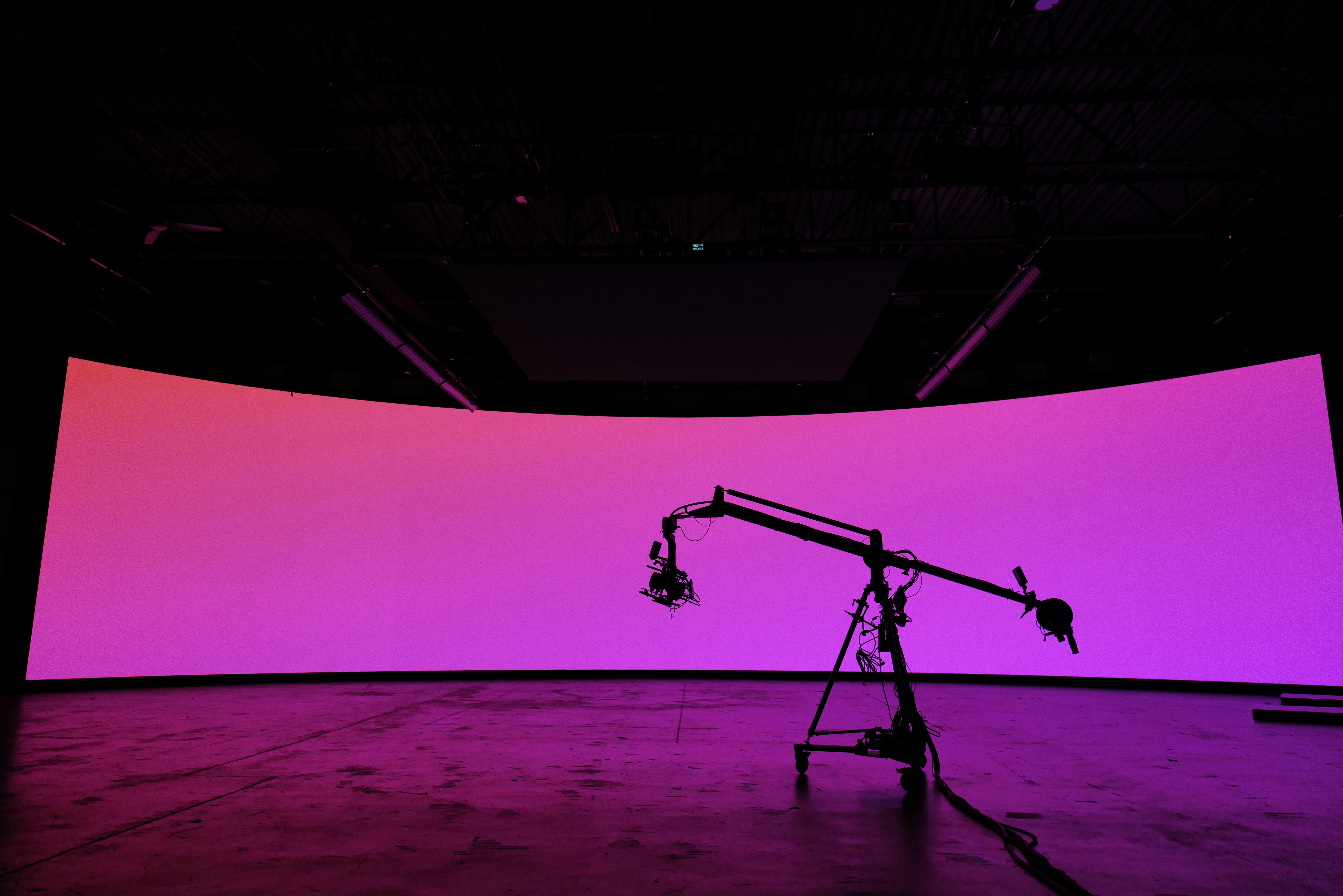
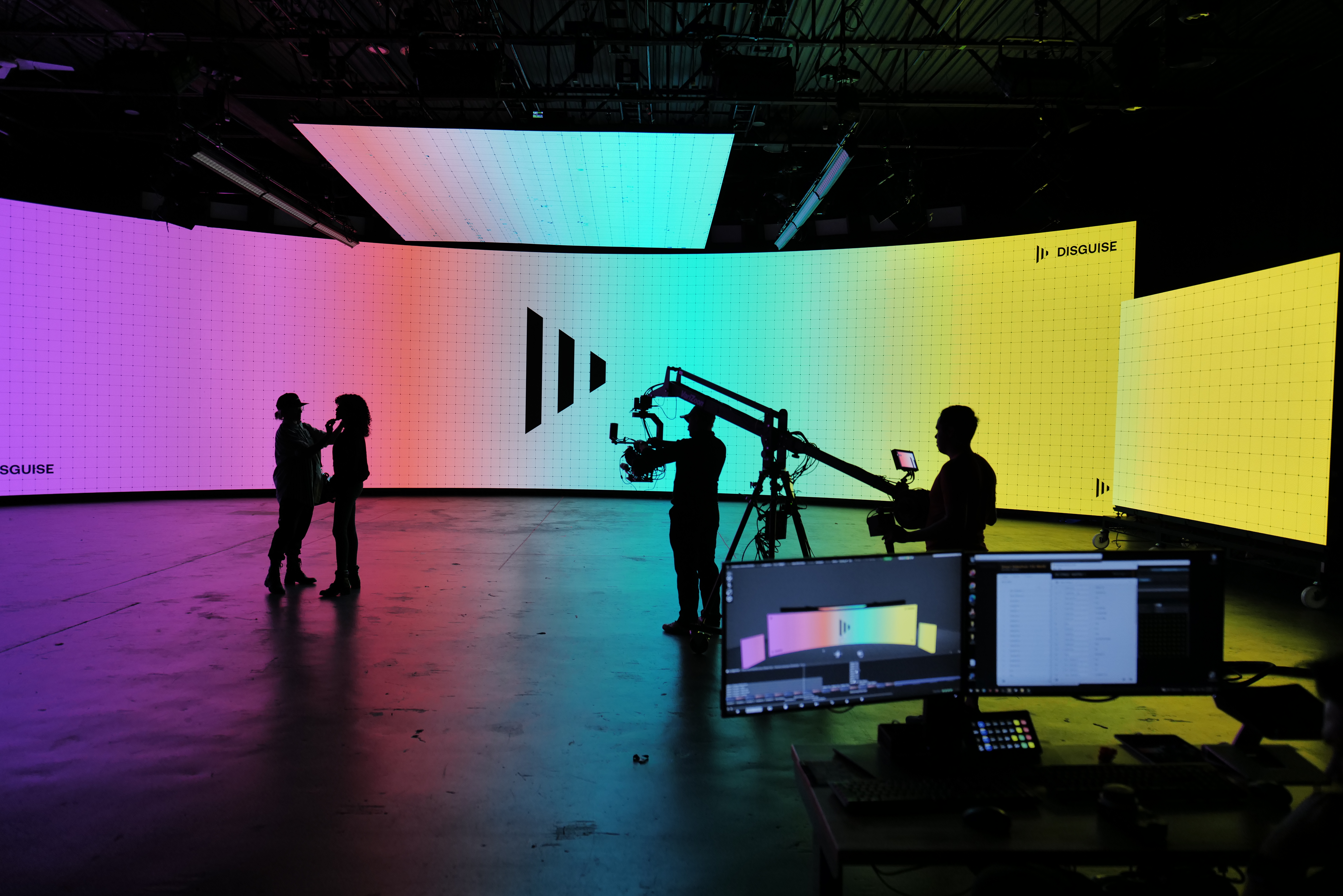

Product examples


